The patch cables change color when you drag them. The color represents the original color of the necessary Doepfer cable. Doepfer cables are color coded by length (at least in 2014 when I build that patch tool).
Oh, I didn't notice! Nice detail. I'd personally prefer a small note next to the cable displaying the centimeter length of that stretch.

It does however look like doepfer use differnt colors than the colors in sketch a patch; http://www.doepfer.de/a100z_e.htm Also the sketch a patch cables seem to have a maximum length, it cycles through colors until they hit black, then stops.

It does however look like doepfer use differnt colors than the colors in sketch a patch; http://www.doepfer.de/a100z_e.htm Also the sketch a patch cables seem to have a maximum length, it cycles through colors until they hit black, then stops.
-- clnclnclncln

Top right you can select the color scheme in the Patch Options
There is Doepfer and Stackable, I guess you had selected Stackcable.

Beep, Bopp, Bleep: info@modulargrid.net


I would like to be able to filter out all clones of Mutable Instruments modules. Each and everyone is making clones of them nowadays, and I am not interested in them at all when I go to https://www.modulargrid.net/e/modules/browser?SearchName=&SearchVendor=&SearchFunction=&SearchSecondaryfunction=&SearchTe=&SearchTemethod=max&SearchBuildtype=&SearchLifecycle=&SearchSet=&SearchMarketplace=&SearchIsmodeled=0&SearchShowothers=1&SearchShow1u=0&order=newest&direction=asc

I know that this is not easy to fix, but it would make at least me happy.


Hi there, in the marketplace, could we have a cookie slightly more persistent than the session for the region/Reverb offers choices? The fact I’m EU based and not interested in offers from US probably will never change, but we constantly need to reselect those options. thank you


I would like to be able to filter out all clones of Mutable Instruments modules. Each and everyone is making clones of them nowadays, and I am not interested in them at all when I go to https://www.modulargrid.net/e/modules/browser?SearchName=&SearchVendor=&SearchFunction=&SearchSecondaryfunction=&SearchTe=&SearchTemethod=max&SearchBuildtype=&SearchLifecycle=&SearchSet=&SearchMarketplace=&SearchIsmodeled=0&SearchShowothers=1&SearchShow1u=0&order=newest&direction=asc

I know that this is not easy to fix, but it would make at least me happy.
-- jgb

How about not showing Others?


How about not showing Others?

-- ParanormalPatroler

I am interested in the Others category, but not clones of MI modules. I cannot really think of a good way to implement my wish, but nevertheless I would love if it was possible to fix. :-)


I see your point, but that's easy to mitigate if you're searching for something specific. Granted, I'd personally prefer if people hid their custom modules, but that's not easy to do and, again personally speaking, I can't be bothered to go and hide each new module that is custom and yet uploaded for all to see.

That being said, if you don't want to remove the Others, then you'll have to wade through all the custom Braids and other non-interesting modules, as they belong under Others and MG has no way of knowing what each user is interested in or not, unless you explicitly say so by using the Search function for something specific.

Hope that helps!


@modulargrid Since 4ms is introducing the Pods, can we lower the minimum case size in Eurorack to 3U 20hp ?


Two suggestions:

1

When building a rack on MD, we have two choices of modules: the general pool of modules and modules we own.

I would like a third tab called "Wishlist." When planning out updates to my system, it would be nice to be able to segregate modules further into ones I actually own and those I'm planning to own or I'm interested in.

2

For unicorn users, being able to set a maximum depth for each row and take it into account when placing modules would also be helpful. Granted, the space under each module can vary depending on what's under it having varying heights within the case. But it would be great to get a warning triggered. I've found myself having to rearrange my physical rack when a module or two exceeded the clearance for that particular row or part of a row.


A new rack theme that is just a clean black line for skiff users pretty please


Request again for narrower racks please! ;-) Not only for 5U formats but now also for EURORACK, since 4ms has come out with their POD series, with the smallest being 20 hp (other sizes are 26, 32, and 60 hp). More info at link below:
https://4mscompany.com/pods.php

Maybe another reason to create the "simple black line" rack style so that even 1 hp racks would be doable?


Request again for narrower racks please! ;-)
-- JohnLRice

O.k. 20HP min it is.
Working themes are Pittsburgh Cell Style and Geeklapeeno Cluster.
Everything else looks like an impossible Escher theme.

Beep, Bopp, Bleep: info@modulargrid.net


Request again for narrower racks please! ;-)
-- JohnLRice

O.k. 20HP min it is.
Working themes are Pittsburgh Cell Style and Geeklapeeno Cluster.
Everything else looks like an impossible Escher theme.
-- modulargrid

Thank you sir!


Is there a way to have different rows to have different widths to plan module arrangements across different cases in one convenient location?

Say four rows 3U 88HP with an Intellijel 7U 104HP case.

Ideally, with those 4ms pods, could a mismatch in depth be highlighted?


Is there a way to have different rows to have different widths to plan module arrangements across different cases in one convenient location?

Say four rows 3U 88HP with an Intellijel 7U 104HP case.

no, that is not possible

Ideally, with those 4ms pods, could a mismatch in depth be highlighted?
-- liquid_air

In the Data Sheets view of your rack you see the deepest modules like in a spreadsheet view.

Beep, Bopp, Bleep: info@modulargrid.net


Is there a way to have different rows to have different widths to plan module arrangements across different cases in one convenient location?
Say four rows 3U 88HP with an Intellijel 7U 104HP case.
-- liquid_air

You could just make one big case with many rows and then fill in the "shorter rows" with blind panels?


Ideally, with those 4ms pods, could a mismatch in depth be highlighted?
-- liquid_air

Unfortunately the data here cannot be fully trusted. I run into such an issue where the depth info both in MG and in the manufacturer's manual is not true, which made me purchase a module which ought to fit in a Pod but didn't. 2hp Rnd v1 still has depth set as 34mm last time I checked and I had to reach out to manufacturer for a change. Real depth is 45mm with power cable, 40mm without. Both are too deep for a Pod and I have no idea why they don't state the real depth.
-- ParanormalPatroler I know! I bought a 2hp NSE and it's deeper then stated and wont fit in a Pod.

Also 4ms seems to have over stated the Pod depth at 34.1mm, from my measurements 32mm and under will fit, under 33mm might fit, and over 33mm probably wont fit. Maybe their prototypes and/or manufacturing proofs were 34.1mm deep but the production copies ended up a little shallower?


Not sure about that. I managed to fit an ADDAC812VU which is 35 mm deep, with no problems.


Not sure about that. I managed to fit an ADDAC812VU which is 35 mm deep, with no problems.
-- ParanormalPatroler hhhmmmm, weird. I measured mine with fairly decent digital caliper.


I also was thinking 19" racks would be cool.


I was thinking that if possible, it might nicer if the Info, Zoom, Rotate and Trash icons were in a sub-popup menu that is opened by clicking on a single icon

They are too prominent, in the way? You can hide them quickly by pressing ESC.
-- solitud

This is SO much better now, thanks for the recent improvement!


@solitud

I see that the pop-up menu now disappears when the mouse is outside the boundaries of the case. That's smooth!!!


@ParanormalPatroler
... and I got desperate messages from iPad users because they could not edit modules in the rack anymore. On touch devices the mouse is always outside the boundaries. Every fix a new bug

Beep, Bopp, Bleep: info@modulargrid.net


Gimme a second to verify on my Android phone.


Hmm, doesn't seem to be a problem on my Android phone. Works as usual. I don't have an iPad. In any case, Esc should be just fine. You don't have to keep this solution if it's causing an issue to users (although I admit I liked it!).


Hmm, doesn't seem to be a problem on my Android phone. Works as usual. I don't have an iPad. In any case, Esc should be just fine. You don't have to keep this solution if it's causing an issue to users (although I admit I liked it!).
-- ParanormalPatroler

Sorry, I missed to write that I already had programmed a condition that checks for touch devices ...
but good to know that it works on Android :)

Beep, Bopp, Bleep: info@modulargrid.net


Just purchased my second year as a Unicorn Account holder. This site is such a wonderful tool. I'm happy to support it.

  1. The biggest feature I would like to see, is the ability to narrow result by multiple manufacturers rather than just one at a time. There are so many modules and makers now that it's a bit crazy trying to wade through them. It would be nice if instead of a list, there were check boxes and I could choose which manufacturers show up in results. Even better if my selection could be remembered for future visits. No offense to any particular manufacturers, there are just some that I have no desire to buy from.
  2. I second the request to filter out the growing number of clone modules. Not showing other/unknown used to help more, but now many clones are coming from known manufacturers.
  3. New/more case design styles.
  4. Ability to search by hp range rather than max or exact. Perhaps a min box and max box. If both are set to the same number, you only get results for that exact hp.
  5. Ability to limit by depth too when planning a rack that knowingly can only accommodate modules so deep.
    Thank you for your time :)

I'll second the #3 above...but only inasmuch as the MU section still needs something to accomodate half-height modules. And yes, even though COTK has a different idea of what MU half-height is, I would figure a "generic" half-height row measurement would work in the same way the 1U tile rows work in Eurorack for both normal and Intellijel format. But at this point where Moon and COTK are both heavily into this size format and there's others inching into it as well, it would seem like something that needs accomodating. A similar situation exists in the Buchla universe with the H series modules plus the 1U "ModuleModules" that Eardrill's got, but that seems more difficult to fix given that each module slot can have either two H-series or four ModuleModules, and this isn't a per-row thing.


Just purchased my second year as a Unicorn Account holder. This site is such a wonderful tool. I'm happy to support it.

  1. The biggest feature [..].
    -- CaptainRockout

These are all well thought out requests, I see what is possible. And of course thanks for supporting!

Beep, Bopp, Bleep: info@modulargrid.net


But at this point where Moon and COTK are both heavily into this size format and there's others inching into it as well, it would seem like something that needs accomodating.
-- Lugia

I started some time ago to put a halfheight row to MU but I have forgotten why I did not finish that. I will pick up the idea...

Beep, Bopp, Bleep: info@modulargrid.net


A requested upgrade for the "similar racks" feature: limit returned racks to one per user to increase relevance and variety of the returned racks.

I did a "search similar" this morning and the return set was the same rack over and over again...all from the same person:
* RackName
* RackName (copy)
* RackName (copy) (copy)
* RackName (copy) (copy) (copy)
* and so on

If the return set were limited to one rack per user, I would be able to see (more useful) racks from other people.

Additionally/alternatively, return multiple pages of similar racks...I'd be happy enough to page through multiple results.

Thank you.
-- danishrancher

For that matter, it would be nice if the 'search similar' would only count one copy of each module. I have a OTool+ on my rack, and the most similar rack is one that has 49 more OTools, I guess we have 50 modules in common the way the script does math...

Basically the feature doesn't work at all, maybe you should just remove it altogether. That would be the easy solution.

-- cg_funk

I saw your post from last year and completely agree...should have referenced or "+1'd" your request as well.
I wouldn't remove it altogether though. I definitely get -some- use out of it...just want it to be even better.


I saw your post from last year and completely agree...should have referenced or "+1'd" your request as well.
I wouldn't remove it altogether though. I definitely get -some- use out of it...just want it to be even better.

-- danishrancher

Hmm. Well I'd love for it to be fixed too!

I am just being realistic... The feature is totally broken and has been for as long as I've been visiting the site. It says I have 26 modules in common with a rack that has only 10 modules in it, and really we have only 1 module in common. It might as well just pick random racks for that matter.

The site is run by the one dude, and frankly, I'm just happy the site is on a stable server after being pwned by the Chinese spammers. I really need MG for only one thing, and it does that perfectly! :-) Thanks again!


Skinny/minimalist case designs. The 4ms Pods just have a thin black line around them (except at the top, which you don't need here). Others are similar. Be nice to have a "non-case case" where the edges are just a black line border rather than an imitation of wood or other "real life" case.


Skinny/minimalist case designs...
-- jschussler

Yes, please!


Skinny/minimalist case designs

+1


OK, I'll throw in for this as well...plus, it's not just the 4ms Pod series that has that look; you also have cases from Make Noise and Intellijel that have that "narrow edge" thing going on.


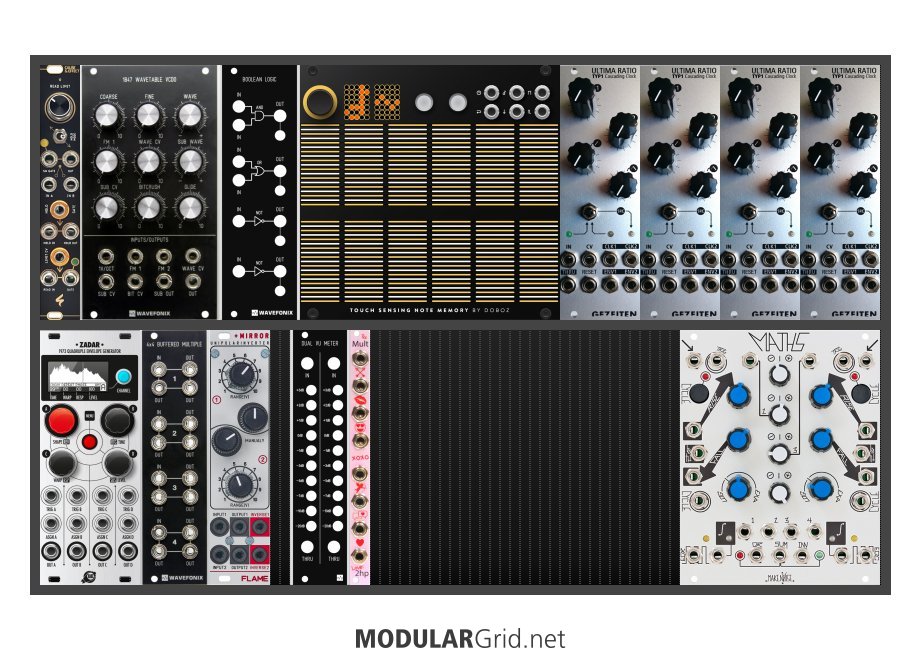
I hear you all, we now have a Minimalist theme.
As a special feature you see the snap grid on that one for precise dragging and better visual reading of available space.
What do you think?

ModularGrid Rack

Beep, Bopp, Bleep: info@modulargrid.net


Yesssss! The additional 1 hp gridding is SUPER useful, too! Thank you, MG Overlords!


Superb! Thank you very much!


Yes please, to both of the "similar racks" suggestions - only count unique modules, and reduce (nearly) duplicate rack results from individual users.

Also, it would be nice if racks with different available space were down weighted. If I have a 3u skiff with 10 modules in it, I would prefer to see other similarly sized racks. I don't care about someone else's rack that has all my modules plus 90 others.

Maybe something like (number of similar unique modules)/(total rack space ratio [big:small]) would be a good metric.


Super nice. Thanks for the addition of the minimalist rack! Super useful for me!


Hi, love the software.
Feature requests:
- Download/ save option of Datasheet
- Datasheet option for all modules i own
- Option to select multiple modules to add to specific rack


Hi, love the software.
Feature requests:
- Download/ save option of Datasheet

I have optimized the print view. Workaround on Mac OS is to hit print and save as PDF.

  • Datasheet option for all modules i own

Just put all modules in one rack is not an option?

  • Option to select multiple modules to add to specific rack

That is a common request and may come at some time.

-- Haus_Sonsbeeck

Beep, Bopp, Bleep: info@modulargrid.net


Hi, love the software.
Feature requests:
- Download/ save option of Datasheet

I have optimized the print view. Workaround on Mac OS is to hit print and save as PDF.

  • Datasheet option for all modules i own

Just put all modules in one rack is not an option?

  • Option to select multiple modules to add to specific rack

That is a common request and may come at some time.

-- Haus_Sonsbeeck

-- modulargrid
Thanks! Super helpfull


@modulargrid Would it be possible to add notes/comments under a patch without having to create a new thread in the forum? I'd like to keep some notes, or maybe a description, about a patch I'm making, but I don't necessarily want to make this public.


@modulargrid Would it be possible to add notes/comments under a patch without having to create a new thread in the forum? I'd like to keep some notes, or maybe a description, about a patch I'm making, but I don't necessarily want to make this public.
-- ParanormalPatroler

It's on the list to detach notes from the forum. That was not the brightest idea in the first place...

Beep, Bopp, Bleep: info@modulargrid.net